
Overview
Designing for clarity when the stakes are exceptionally high.
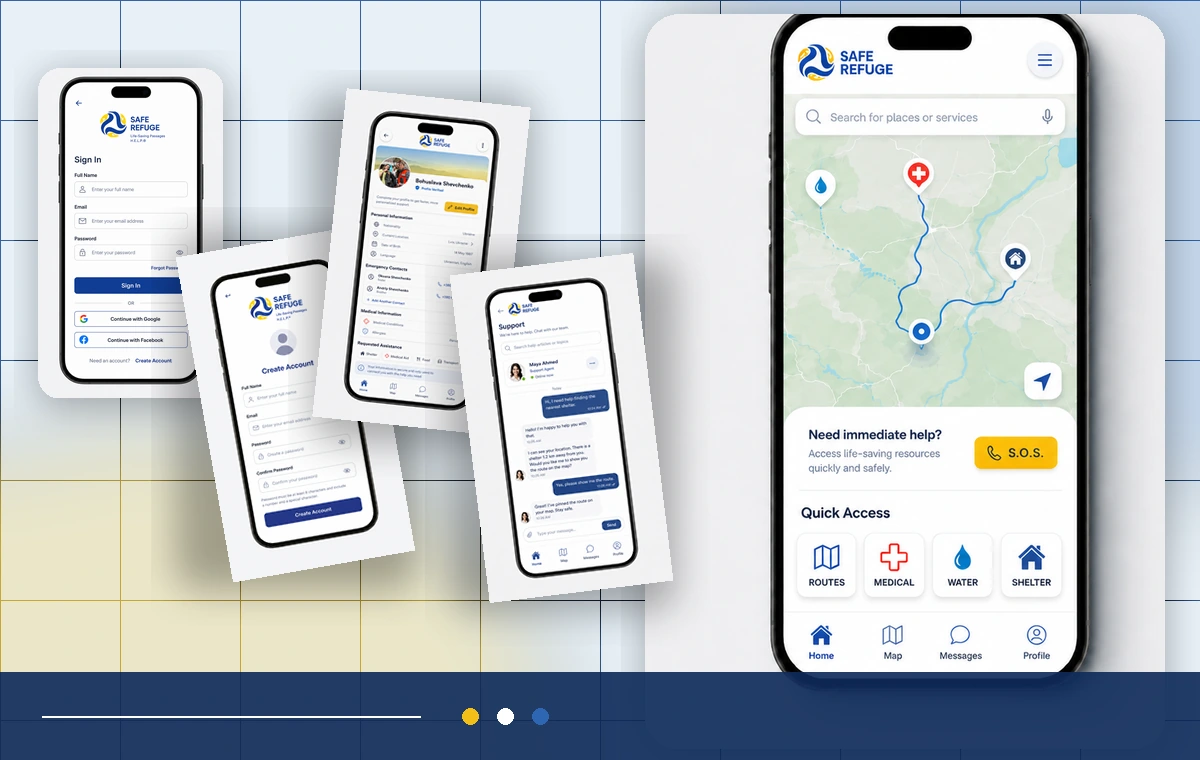
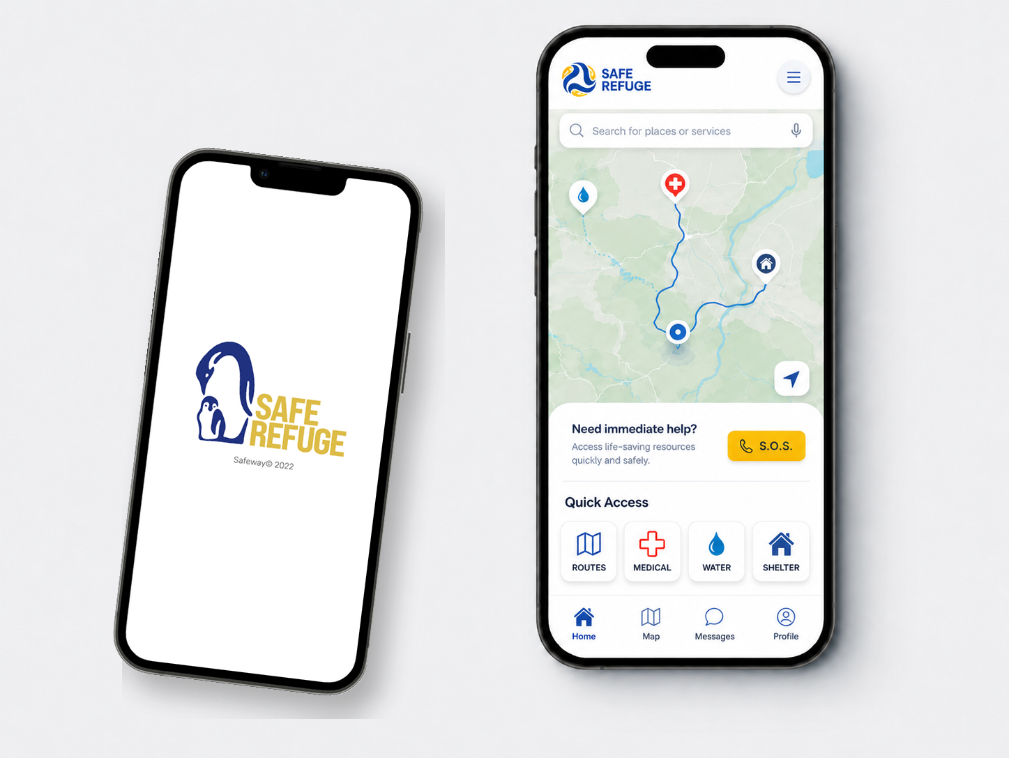
H.E.L.P. explores a mobile experience that could help civilians identify safer passages and locate food, water, shelter, and medical support during conflict.
The central challenge was not feature breadth. It was reducing cognitive load when attention, language, connectivity, and trust may all be constrained. The experience needed to make location, route, resource type, and next action understandable at a glance.
Design question: How might critical information remain understandable and actionable under extreme stress?
Portfolio context: This is a concept study. It demonstrates research, interaction, accessibility, and systems thinking; it is not presented as a deployed emergency service.
Process
From human context to an actionable route.
The project moved from persona and journey work into map interactions, low-fidelity testing, revised language, and a high-fidelity prototype.
Frame
Clarify the user, context, constraint, and decision.
Learn
Build evidence through research and journey analysis.
Make
Explore flows, wireframes, and interactive prototypes.
Validate
Test, identify friction, and revise the experience.
Final interface
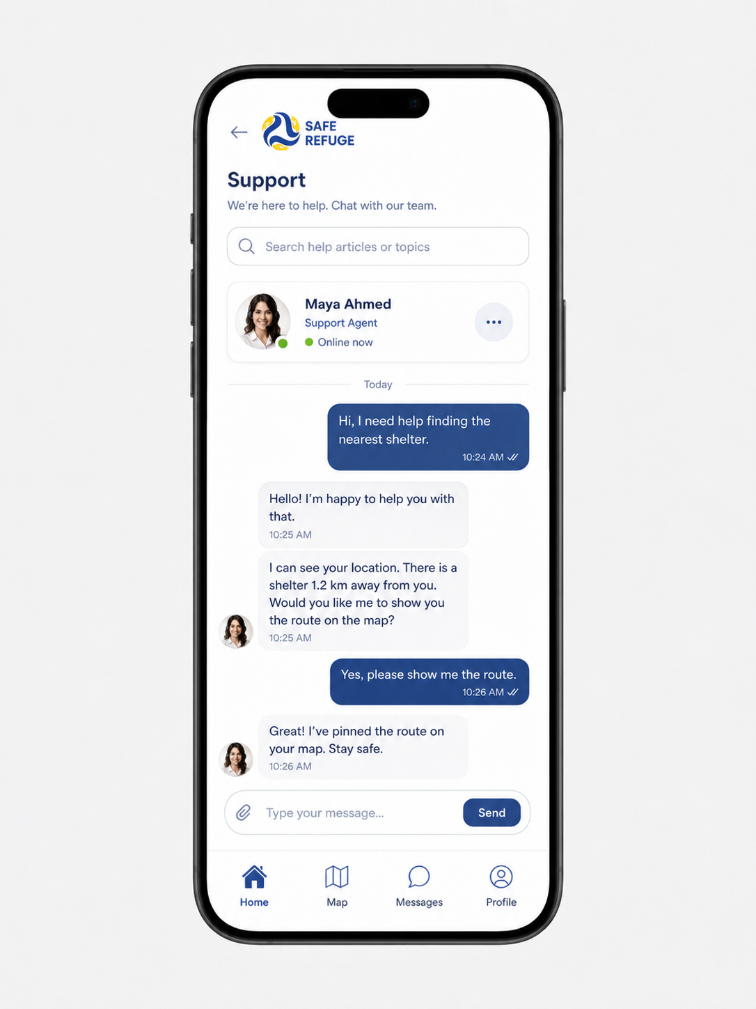
Use the real screens to show how the system works together.
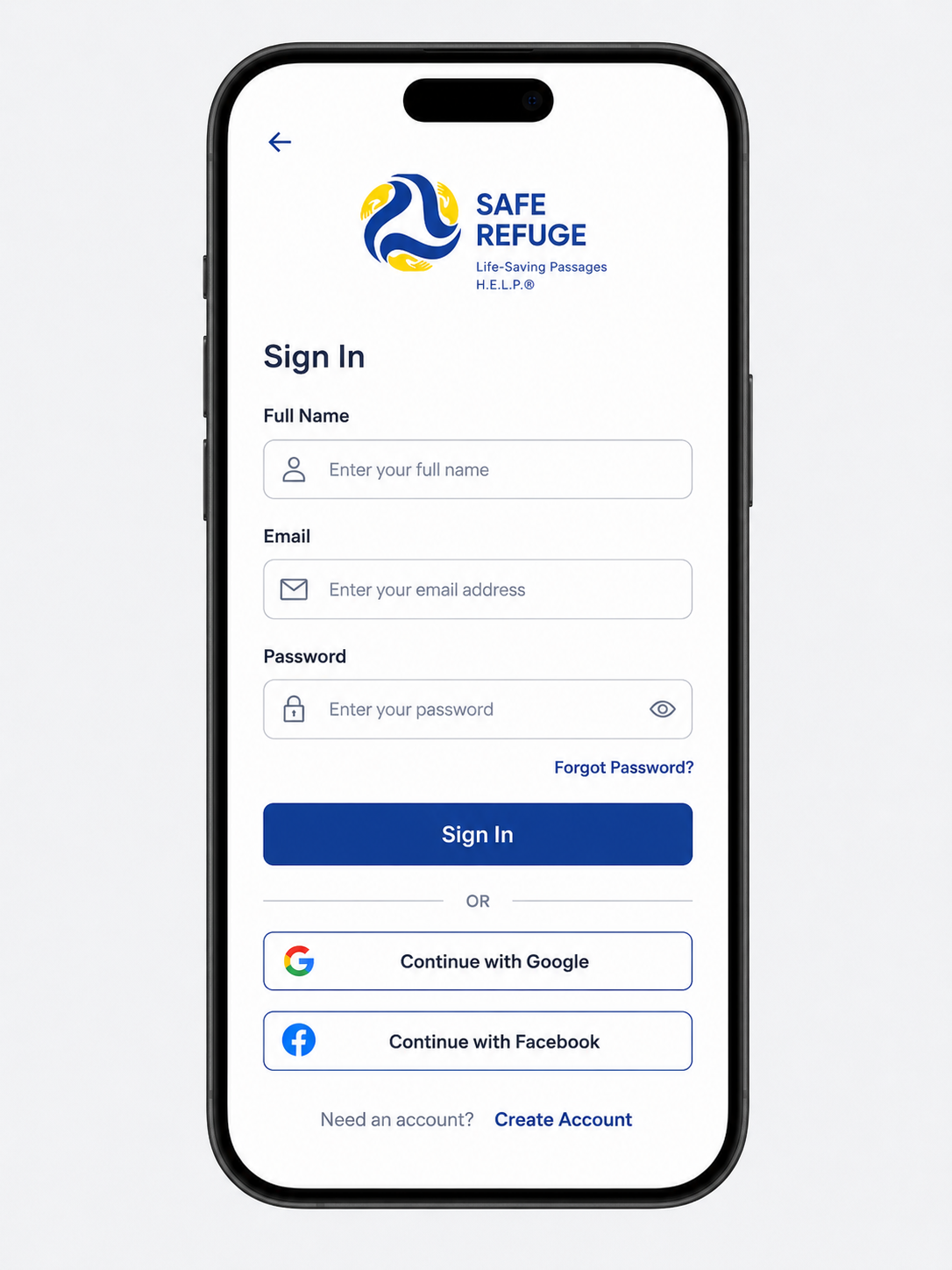
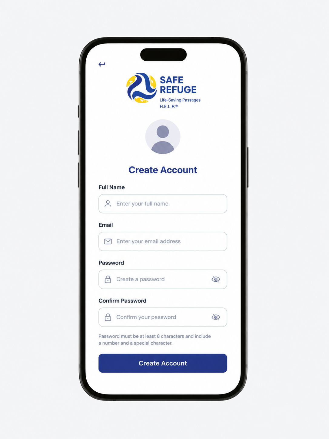
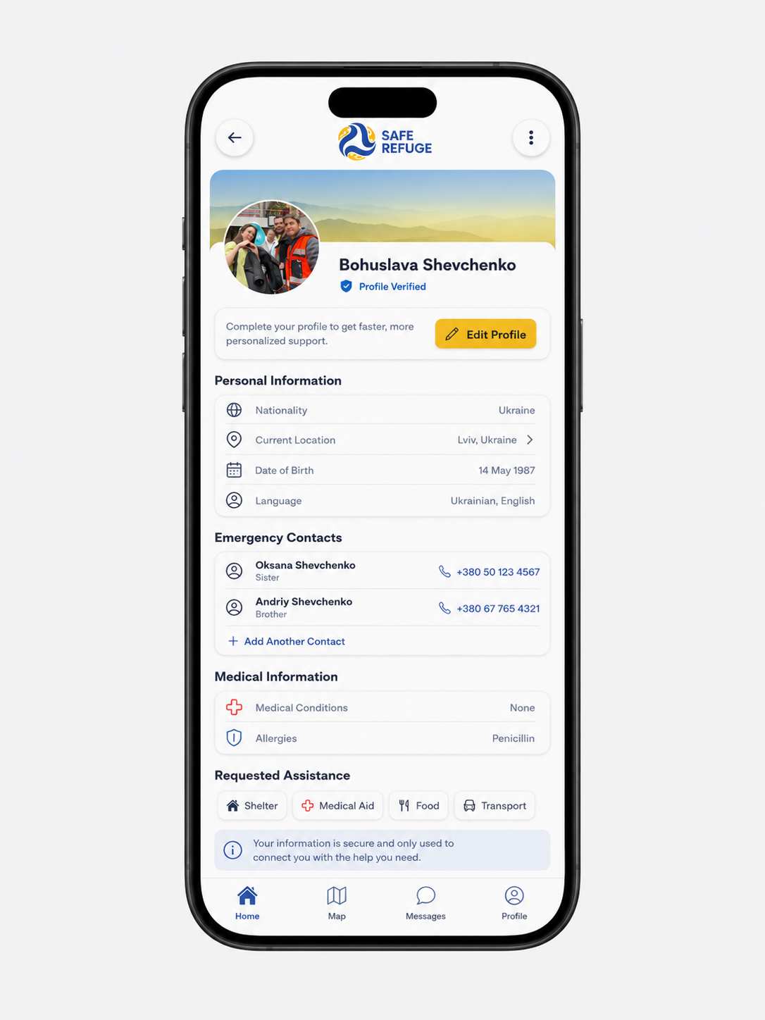
The refined H.E.L.P. experience carries the same hierarchy, language, and safety cues from account entry through the primary map, profile information, and support.
Research insights
Four areas of friction shaped the redesign.
The original moderated remote study included five participants in sessions of approximately 20–30 minutes.
Resource icons were ambiguous
The symbol intended to represent water was not consistently understood.
Current location was easy to miss
Participants needed a stronger, more unmistakable “you are here” signal.
Language did not travel well
Terms such as “counselor” did not translate clearly across languages and contexts.
Shelter choice lacked context
People needed clearer information to determine which location fit their immediate needs.
Design decisions
Reduce interpretation. Increase confidence.
Make location unmistakable
Increase contrast, scale, and persistence of the user’s position relative to the recommended route.
Use literal, plain-language labels
Pair recognizable symbols with words and avoid terminology that depends on cultural or professional context.
Simplify address entry
Replace fragmented address fields with a direct input pattern that matches how participants expected to enter a location.
Explain resource fit
Show essential attributes—capacity, services, accessibility, and distance—before asking someone to choose.
Accessibility
Accessibility is core interaction logic, not a finishing pass.
The concept emphasized readable typography, strong visual hierarchy, enhanced contrast, redundant icon-and-text cues, and page structure intended to support assistive technology. In a real-world deployment, the next design phase would also need to address offline behavior, low bandwidth, localization, safety verification, device sharing, and trauma-informed content.
Reflection
The interface is only one part of a safety system.
A route can appear clear while the underlying information is incomplete, outdated, or unsafe. The most important next steps would involve partnership with humanitarian experts, continuous data verification, local language research, field testing, and explicit trust signals.
The leadership lesson is broader: in high-risk products, UX must help the organization reason about operational integrity—not only usability.