
Overview
Designing movement around confidence, not performance pressure.
Swimo explores how older adults could discover appropriate water-based workouts, understand what to do next, and maintain continuity between a phone and a wearable.
The concept treats aquatic exercise as a full experience: choosing an appropriate level, preparing for a session, following instruction in the moment, and seeing progress afterward.
Design focus: make the next step obvious before, during, and after a workout.
Evidence note: The source material is primarily interface design. This case study presents design intent and iteration without claiming unverified research outcomes.
Prepare
Use the phone for level selection, workout discovery, guidance, and expectations.
Move
Use the watch for immediate instruction, live metrics, pause, break, and end controls.
Reflect
Return to the phone for workout history, progress patterns, recommendations, and motivation.
Design evolution
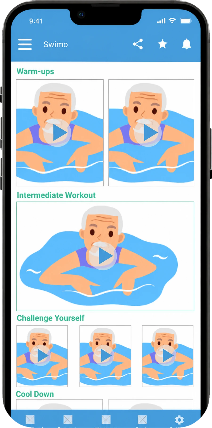
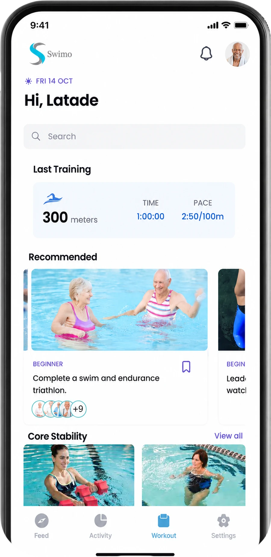
From a dense workout catalog to a calmer, more guided starting point.
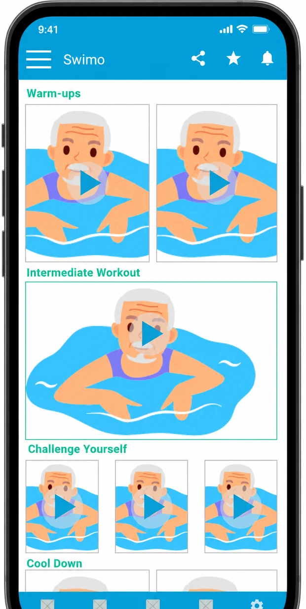
The earlier direction exposed many workout choices at once. The refined home concept shifts the emphasis toward recent activity, recommendations, and recognizable next steps while keeping the navigation consistent.
Personalization + progress
Set the right level first, then make progress easy to understand.
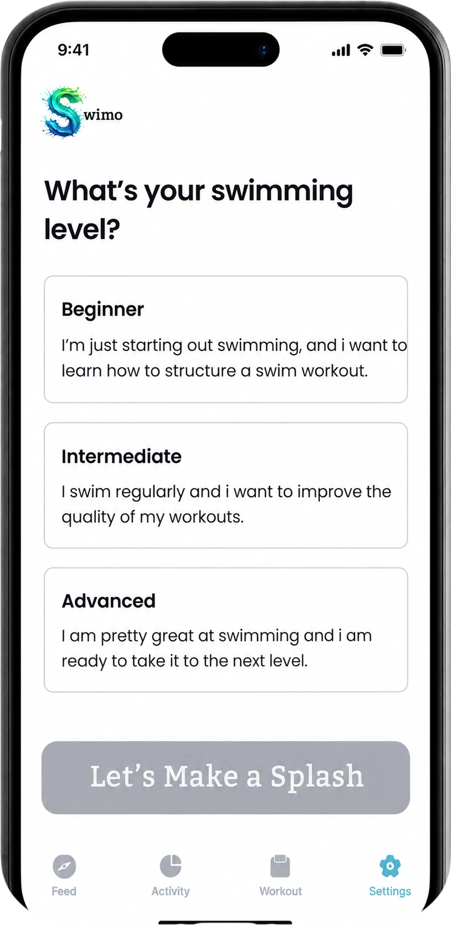
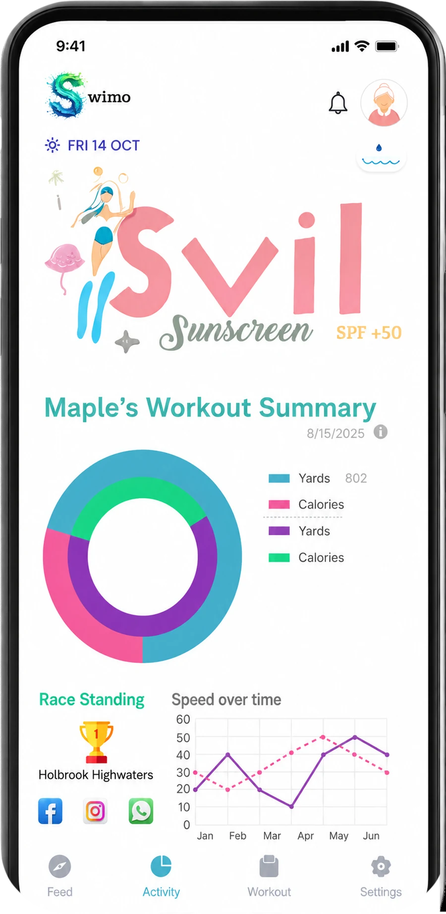
The setup and summary screens work as a pair: one establishes the user’s starting point, while the other turns completed activity into feedback without requiring the user to interpret a complex fitness dashboard.
Choose a swimming level
Beginner, intermediate, and advanced descriptions explain the intent behind each level in plain language.
Summarize the workout
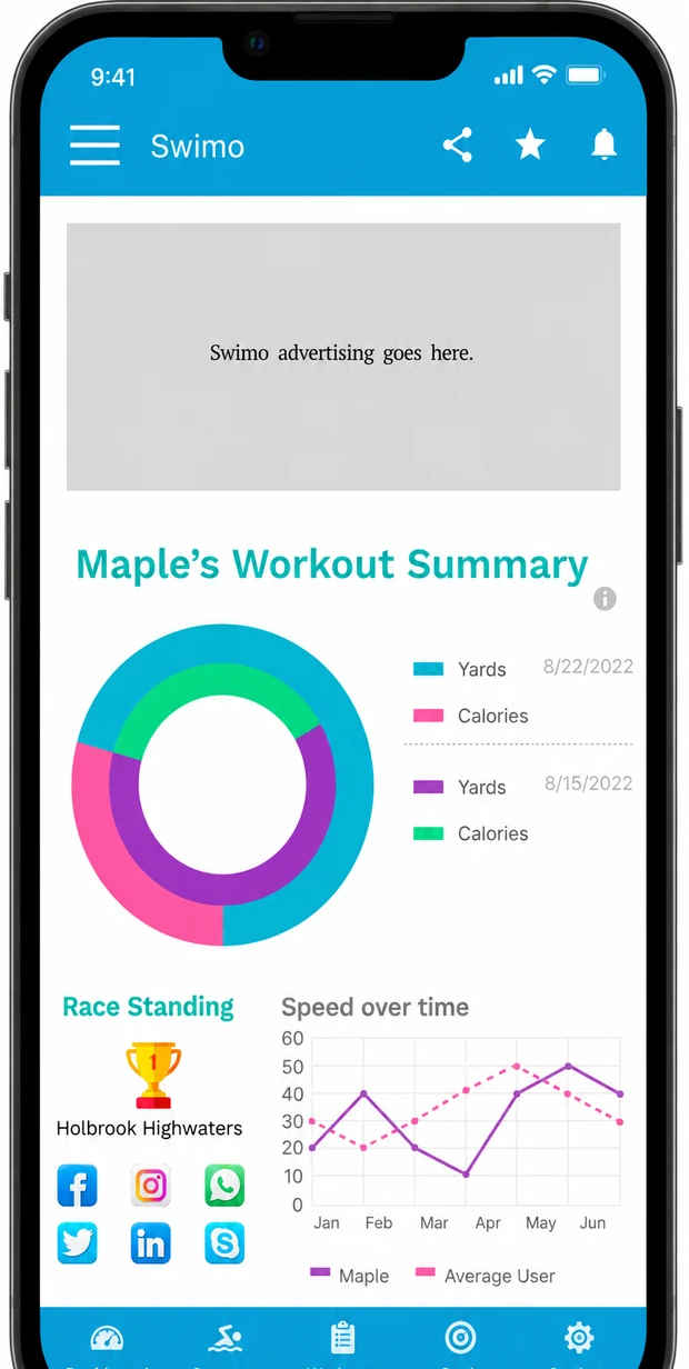
Activity, race standing, and speed trends are grouped into a single follow-up view.
Cross-device continuity
The watch stays focused on the moment of movement.
Instead of recreating the full phone app on a smaller screen, the watch concept narrows the experience to selecting an activity, following the current exercise, viewing essential metrics, and controlling the session.
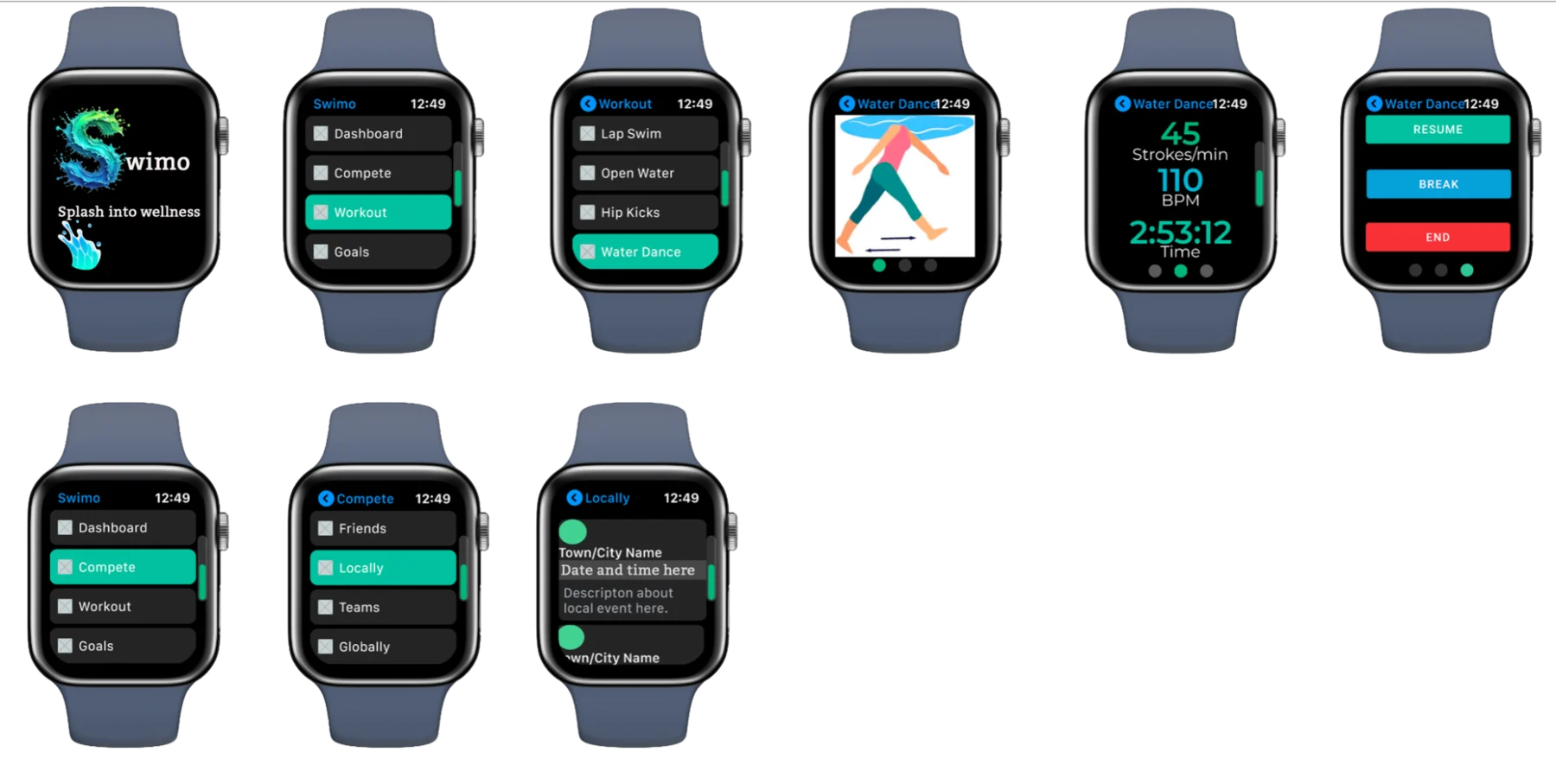
Pick the workout or competition context.
See one activity and the most relevant metrics.
Resume, take a break, or end the workout with direct actions.
Earlier explorations
Iteration becomes part of the story instead of visual clutter.
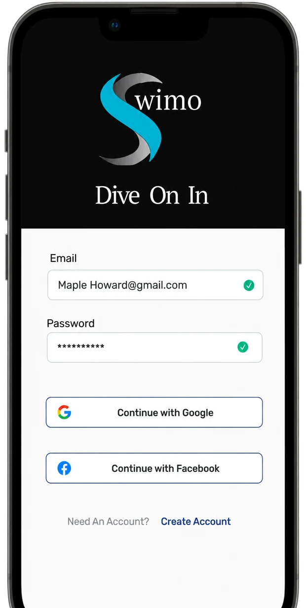
Rather than mixing every visual direction together, the earlier sign-in and analytics concepts are grouped as an archive. This keeps the case study focused while still showing how the interface language evolved.
Design decisions
Make the system feel supportive, not demanding.
Use plain workout language
Explain levels and activities in terms the user can understand before committing to a session.
Keep navigation stable
Use a small set of persistent destinations so the user does not have to relearn the interface between tasks.
Separate planning from movement
Let the phone carry richer discovery and history while the watch remains focused on the current action.
Surface progress without overload
Group metrics into understandable summaries instead of presenting every available measurement at once.
Accessibility
Age-inclusive interaction has to work in the real pool environment.
Large type, strong contrast, consistent navigation, visible labels, forgiving targets, and redundant cues are a baseline. For a real product, those patterns would need validation with older adults across vision, hearing, dexterity, cognition, aquatic comfort, and device familiarity.
Controls should remain large, direct, and difficult to trigger accidentally.
Meaning should not depend on small type, subtle color differences, or dense charts.
Each step should clarify what is happening now and what the user can do next.
Moving from phone to watch should preserve workout context rather than restart the task.
Next steps
Turn the strongest design assumptions into evidence.
A responsible next phase would validate workout comprehension, safety language, skill-level selection, video or motion guidance, notification load, progress visualization, and the phone-to-watch handoff.
The next design test should happen as close as possible to the actual use environment—around water, with realistic lighting, motion, wet hands, and the interruptions that come with a pool setting.